Fhoster: A Bold, Confident Display Font
First Glance: Sharp, Structured, and Unapologetically Present
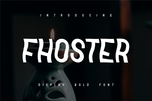
Fhoster hits you like a well-placed accent light—not loud for the sake of noise, but precise, intentional, and instantly memorable. It’s not playful or nostalgic; it’s modern typography with architectural discipline. The letterforms carry weight without heaviness—clean terminals, subtle contrast between thick and thin strokes, and a rhythm that feels both grounded and forward-moving. Uppercase letters command attention; lowercase has restrained personality—no flourishes, no distractions. This isn’t a font that whispers. It declares.
Where Fhoster Earns Its Place in Real Work
I’ve used Fhoster across client projects where visual authority mattered more than whimsy: a boutique skincare line’s product labels, a limited-run art book’s chapter headers, a tech-adjacent podcast’s social media graphics. In every case, Fhoster delivered clarity and cohesion—not just as decoration, but as functional design assets.
Logo design? Yes—if the brand leans into confidence, craftsmanship, or contemporary minimalism. It works especially well when paired with a neutral sans serif for body copy. I avoided it for service-based brands needing warmth or approachability; Fhoster doesn’t soften easily.
Packaging design and product labels are where Fhoster shines brightest. On matte-finish glass bottles or rigid kraft boxes, its structure translates beautifully to physical texture. It holds up under spot UV or foil stamping—no fragile details to blur or break. For merchandise, I tested it on cotton tees and ceramic mugs: clean at 48pt and above, legible even when slightly off-register during screen printing.
In web design, I reserved Fhoster for hero headers and section titles—not navigation or body text. Its x-height is generous, but the tight default spacing needs manual tweaking for digital readability. I adjusted letter-spacing by +20–40 units in CSS for headlines, and always paired it with a highly legible sans serif (like Inter or Manrope) for supporting text.
For social media graphics and digital ads, Fhoster cuts through feed clutter. It performs exceptionally well in static Instagram posts and Pinterest pins—especially against solid-color or blurred photo backgrounds. On video thumbnails? Still strong, though I avoided using it below 36px due to subtle stroke variation that blurs at small sizes.
Editorial design calls for restraint: I used it only for pull quotes and chapter openers—not running text. In printable design like invitations or posters, it thrives at 72pt and up. For Canva templates and Cricut projects, its clean vector outlines scale flawlessly—no hint of distortion, even when stretched across 24-inch vinyl banners.
When—and How—to Use It With Intention
Fhoster is a display font. That’s not a limitation—it’s a directive. Use it for large headlines, short phrases, brand marks, and decorative accents. Avoid long paragraphs, captions under photos, or anything requiring rapid scanning. It’s not built for speed—it’s built for impact.
It excels in premium packaging and social posts where tone matters as much as message. Think luxury candles, independent publishing, gallery announcements, or high-end apparel drops. It signals intentionality—not trend-chasing.
As a commercial font, Fhoster supports multilingual Latin character sets, including accented characters for European markets. But don’t assume it covers Cyrillic or extended diacritics unless verified—I checked the specimen file before committing to a bilingual campaign.
What It Does to Your Design—and Your Audience
Fhoster elevates perceived professionalism without feeling cold. When paired thoughtfully, it strengthens brand consistency across touchpoints—because its voice stays coherent whether printed on a business card or animated in a website header. That consistency builds audience trust: people sense deliberate craft, not placeholder energy.
It shapes visual mood decisively. Paired with warm neutrals and soft photography, it reads calm and elevated. With stark black-and-white and tight cropping? It becomes editorial and incisive. Either way, recognition improves—its silhouette is distinct enough to become part of a brand’s visual shorthand over time.
That said, it won’t boost engagement by itself. Used carelessly—overly tight tracking, poor color contrast, or mismatched pairings—it reads stiff or sterile. Engagement comes from alignment: does Fhoster reflect who the brand *is*, not just what it sells?
Designer Notes You’ll Actually Use
- Always test Fhoster in black and white first—its strength lies in contrast, not color tricks.
- Check small-size readability at 24–32px on screen and 8–10pt in print. It falters below that—intentionally.
- Drop it onto real mockups, not just white artboards. See how it behaves on textured paper, brushed metal, or gradient backgrounds.
- Compare uppercase vs. lowercase usage. Uppercase gives authority; lowercase adds subtle nuance—but avoid mixing both in one headline unless deliberately contrasting.
- Review spacing closely. Default kerning is tight. Loosen tracking for headlines; tighten only for tight-fit lockups (like monograms).
- Test font pairing rigorously: beside a classic serif font (e.g., Adobe Garamond), a clean sans serif font (e.g., Poppins), a relaxed script font, a textured handwritten font, and another bold display font. Fhoster pairs best with breathing room—not competition.
- Confirm commercial licensing before any client work, digital product, or printable design. Some licenses restrict use in SaaS platforms or resale templates—read the fine print.
A Final Word for Practitioners
Fhoster isn’t a “safe” choice—and that’s why it works. It asks you to commit, to edit tightly, to choose hierarchy with purpose. It rewards designers who treat type as infrastructure, not ornament. If your project needs quiet elegance, try something else. But if it needs presence, precision, and a voice that doesn’t fade into the background—Fhoster earns its place. Not as decoration. As decision.